
Tijuana Garage
What started as a chance encounter in an antique mall turned into a rewarding design opportunity. I met a patron who was wearing a shirt I had designed for The Varsity in Atlanta—it turned out to be his favorite. This connection led to my involvement in creating logos and supporting branding materials for his two Atlanta restaurants: Front Page News and Tijuana Garage. It was a great experience to bring my creative vision to these vibrant, local spots.


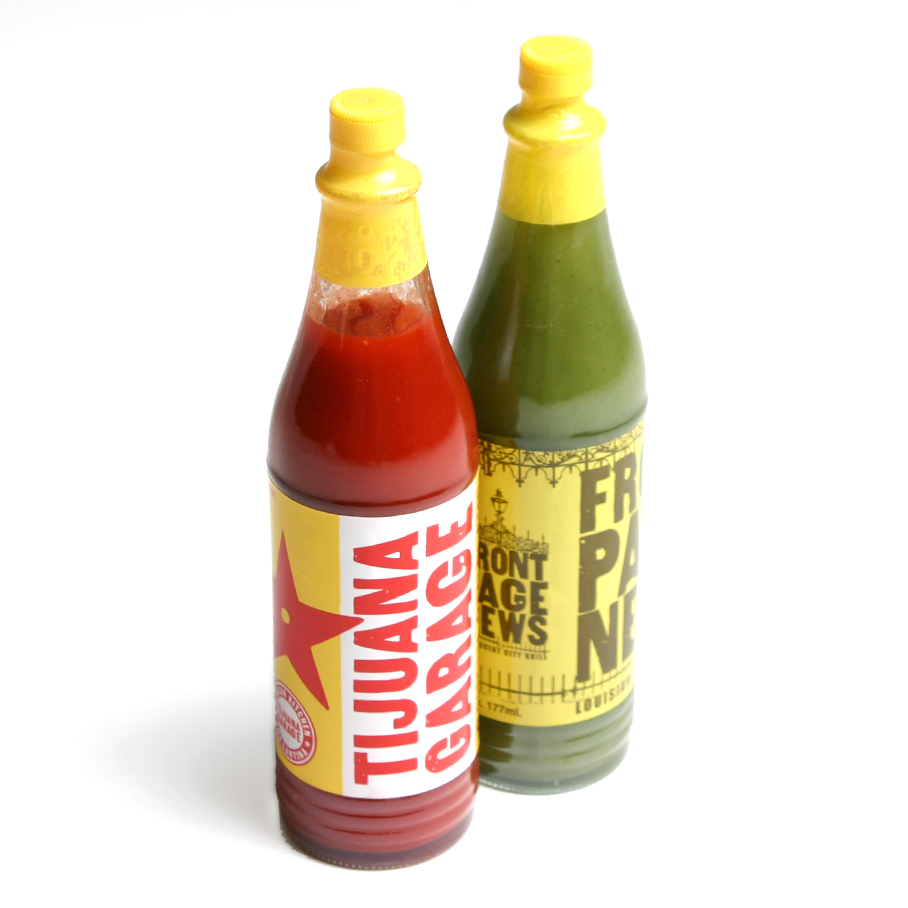


For Tijuana Garage, the design inspiration came from the nostalgic roadside gas stations and pit stops of the 1950s and 1960s—think Mobil, Shell, and 76. To capture the retro, bold vibe, I knew a standard typeface wouldn’t cut it. Instead, I scanned woodblock prints from vintage letterpress posters, digitizing them to create a custom typeface that perfectly aligned with the aesthetic and spirit of the brand.